Dashboard For Netflix Price
Project Description
Stack: CSV . Excel · Power Query
This project analyzes Netflix subscription fees and content availability across different countries. I started with a raw CSV dataset containing columns such as Country, Total Library Size, No. of TV Shows, No. of Movies, and Cost per Month (Basic, Standard, Premium). Using Power Query, I cleaned and transformed the data before building an interactive Excel dashboard that reveals global patterns in pricing and library size.
What the dashboard shows
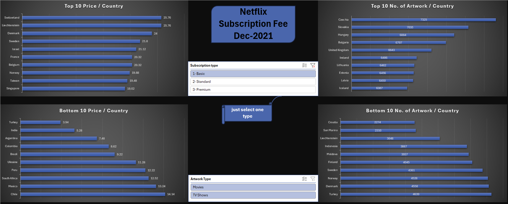
• Top 10 most expensive countries for Netflix subscriptions (e.g., Switzerland, Liechtenstein, Denmark).
• Bottom 10 cheapest countries (e.g., Turkey, India, Argentina).
• Top 10 countries with the largest Netflix libraries (e.g., Czechia, Slovakia, Hungary).
• Bottom 10 countries with the smallest libraries (e.g., Croatia, San Marino, Liechtenstein).
• Interactive filters to switch between subscription type (Basic, Standard, Premium) and content type (Movies, TV Shows).
Outcome & value
The dashboard provides insights into global Netflix affordability and content distribution, allowing users to identify where Netflix is most cost-effective and where its content library is limited. These findings could support consumer decision-making, market research, or competitive analysis in the streaming industry.